You’ve picked your brand colours. You’ve got a slick logo. Your Instagram feed is giving.
But then… you slap Comic Sans or Times New Roman on your flyers — and the vibe is gone.
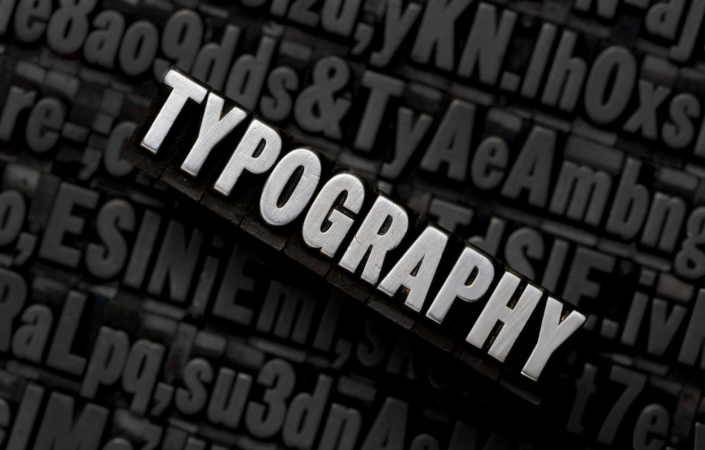
Let’s be real: your fonts are speaking — even before your words do.
Typography isn’t just about looking cute. It’s about vibes, perception, and personality. It can make your brand feel youthful or serious, high-end or budget, playful or professional.
So, how do you pick fonts that actually match your brand’s voice (and don’t make you look like you built your website in 2006)? Let’s dive in.
1. First, Understand Your Brand Personality
Are you a fun, loud streetwear brand? A minimalist skincare line? A buttoned-up fintech startup?
Different brands = different voices.
Different voices = different fonts.
Think of typography like dressing up your brand. You wouldn’t wear agbada to the gym — so don’t dress your edgy brand in corporate fonts either.
Here’s a cheat sheet:
| Brand Type | Font Vibe |
|---|---|
| Luxury | Serif, elegant fonts like Playfair Display or Garamond |
| Modern & Clean | Sans-serif fonts like Helvetica or Montserrat |
| Playful & Youthful | Rounded or handwritten fonts like Comic Neue or Poppins |
| Tech or Finance | Geometric or ultra-clean fonts like Inter or Roboto |
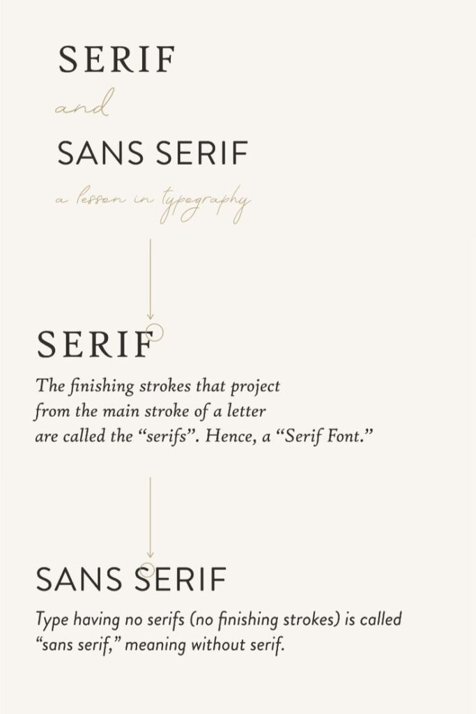
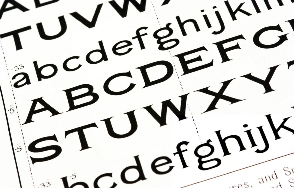
2. Serif vs Sans-Serif: Know the Basics
Let’s demystify the typography buzzwords.
- Serif fonts have little strokes at the ends of letters. They feel classic, serious, and high-end.
→ Think: Vogue, The New York Times. - Sans-serif fonts have no strokes — clean and modern. They’re easier to read on screens.
→ Think: Google, Netflix.
So, if your brand is old-school and trustworthy, serif might work. If you’re sleek and digital-first, sans-serif is probably better.
3. Choose ONE Hero Font — and Two Sidekicks Max
You don’t need 12 different fonts to look creative. You’ll just end up looking confused.
- Hero font: This is your main typeface — the one you use for headers and key visuals.
- Body font: A clean, readable one for paragraphs.
- Accent font (optional): Something bold or playful for attention-grabbing parts like callouts or quotes.
Too many fonts = design wahala.
Stick to 2–3 max for consistency.
4. Consider Where the Fonts Will Live
Are you mostly on social media? Your website? Printed flyers?
Some fonts look great on print but messy on screens. Others look amazing on a mobile device but get lost in print.
Always test your font choices in real life:
- Do they scale well?
- Are they legible on small screens?
- Do they match the tone of your captions and copy?
Typography isn’t just an aesthetic choice — it’s a user experience decision.
5. Match the Font to Your Tone — Not Just Your Logo
Fonts are more than decoration — they’re part of how your brand talks.
A chilled, friendly brand using stiff, corporate fonts? Confusing.
A premium skincare brand using cartoonish fonts? Instant downgrade.
When your font matches your tone, your brand feels more cohesive, professional, and trustworthy.
6. Avoid These Rookie Mistakes
Let’s save you some embarrassment. Avoid:
- Comic Sans: Unless you’re running a kindergarten. Even then, rethink it.
- Too many effects: Shadows, outlines, rainbow colours? Please, no.
- Overused fonts: Everyone and their uncle uses Lobster or Pacifico. Try something fresh.
Pro tip: Sites like Google Fonts or Fontpair can help you pair fonts smartly.
7. Typography = Silent Branding
People might not say “Oh, I love their font.” But they’ll feel the vibe. And that matters.
Typography is the quiet brand ambassador that shows up everywhere — your flyers, social posts, packaging, website, business cards.
If your font is off, the whole experience feels off.
Let Your Fonts Speak Fluently
Choosing the right font isn’t about being trendy. It’s about clarity, consistency, and character.
A well-chosen font says:
- “I know who I am.”
- “I care about details.”
- “You can trust me.”
And in business — especially for small businesses trying to stand out — that level of intentionality can make all the difference.
So the next time you’re designing something for your brand, ask:
Does this font speak my brand’s language — or just mumble through it?